The Role of Color Harmony in Outdoor Spaces
Color theory is a tool that helps us understand how to use colors effectively. When applied to outdoor spaces, it can transform a dull area into an inviting retreat. Colors affect our mood and perception, making them crucial in designing patios. By using color strategically, you can create a space that feels larger or more intimate, warmer or cooler, depending on your goals.

How To Use Color Theory In Patio Landscaping Designs Lee’s Summit MO 64081
Understanding Color Wheel Basics for Design
The color wheel is your starting point in understanding color theory. It consists of primary colors: red, blue, and yellow; secondary colors created by mixing the primary ones; and tertiary colors formed by mixing primary and secondary hues. For effective patio landscaping, using complementary colors like blue and orange or analogous shades like green and yellow can create harmony or contrast as needed.
The Impact of Warm and Cool Colors
Warm colors like red, orange, and yellow are energizing and make spaces feel cozy. Conversely, cool colors such as blue, green, and purple evoke calmness and openness. In patio landscaping designs, these elements can define zones within a space. A mix of both warm and cool tones will offer balance and visually appealing dynamics.

How To Use Color Theory In Patio Landscaping Designs in Lee’s Summit MO 64081
Using Color Schemes to Achieve Desired Effects
Different color schemes can help you achieve specific effects in patio design. Monochromatic schemes rely on different shades of a single color for a unified look. Complementary schemes use opposite colors on the color wheel for vibrancy. Analogous schemes feature adjacent colors for subtlety. Choose a scheme based on the emotional atmosphere you wish to cultivate in your outdoor area.
Practical Tips for Selecting Patio Furnishings
Choosing furnishings with the right colors is key to cohesive design. Consider neutral tones for large surfaces like decking or walls to allow colorful accessories to pop. Decorate with pillows, planters, or rugs in varying hues to add interest without overwhelming the senses.
Incorporating Natural Elements for Balance
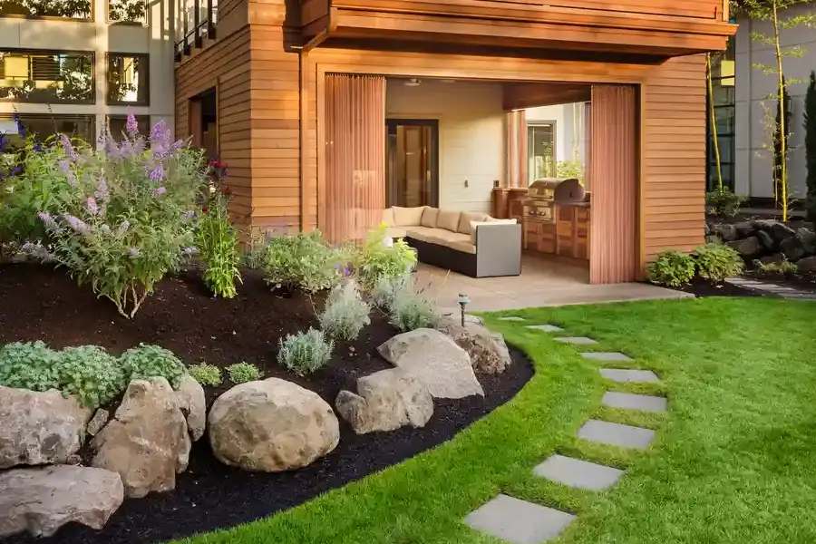
Nature offers a palette of its own that complements man-made designs. Incorporate greenery and wood tones alongside your selected color scheme for a balanced appearance. This approach not only enhances aesthetics but also fosters a connection with nature.
Case Study: Transforming Small Spaces With Color
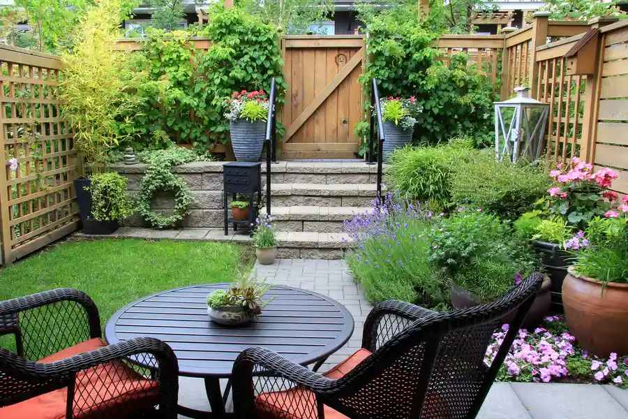
For compact patios, strategic use of color can make all the difference. Light colors can make small areas appear bigger, while dark shades may enclose them further. An example would be using pale blues or greens as a backdrop with vibrant furniture pieces to draw attention to focal points.
Cost-Effective Strategies Using Paints and Plants
You don’t need to spend much to implement color theory in your design. Use paint to refresh old furniture or introduce new garden plants that align with your chosen palette. These changes offer cost-effective ways to enhance your patio’s visual appeal.
Your Next Steps With Patio Design
Applying color theory in patio designs enhances aesthetic appeal and function. Experimenting with different hues lets you discover what best suits your personal taste and surroundings. For expert guidance in transforming your outdoor space, contact Presto Landscapes at (719) 464-4230. We serve clients across Lee's Summit, MO and specialize in creating stunning outdoor environments that reflect individual styles.
